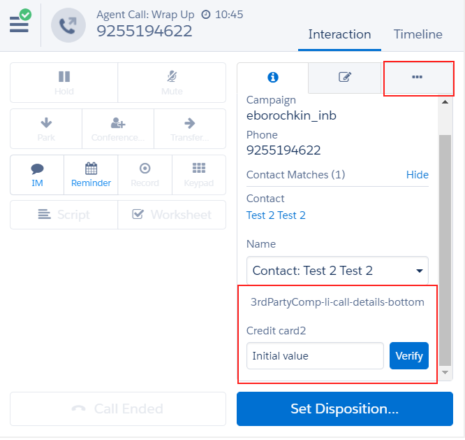
CustomComponentsApi allow extending ADT with custom UI elements. JavaScript handlers and template for UI elements can be defined in the external page. Handlers will be invoked using Five9 SDK library. SDK users are allowed to customize position of elements using flexbox layout attributes. Styling of UI elements is predefined by ADT.
Defining template and callbacks
Custom components template is a string with a list of tags defining components. Callback names can be defined in the onclick and onchange handlers of components.
Callbacks implementation is defined as javascript object with property functions matching names of the callbacks defined in custom components.
window.Five9.CrmSdk.customComponentsApi().registerCustomComponents({
  template: `<adt-components>
    <adt-component location="3rdPartyComp-li-call-tab" label="3rdPartyComp-li-call-tab" style="flex-direction: column">
      <adt-input value="Initial value" id="aaa1" name="input1" label="Credit card1" placeholder="this is placeholder1"
                 onchange="callTabInputCallback"></adt-input>
      <adt-btn-group label="Group of buttons">
          <!-- comments are ignored and styles are filtered by whitelisting -->
          <adt-button name="button1" label="Yes" class="btnPrimary" style="flex-grow: 1; justify-content: center;"
                      onclick="callTabYesCallback"></adt-button>
          <adt-button name="button2" label="No" class="btnSecondary" style="flex-grow: 1"
                      onclick="callTabNoCallback"></adt-button>
      </adt-btn-group>
    </adt-component>
    <adt-component location="3rdPartyComp-li-call-details-bottom" label="3rdPartyComp-li-call-details-bottom" style="flex-direction: row; justify-content: space-between; align-items: flex-end;">
      <adt-input value="Initial value" name="input2" label="Credit card2" placeholder="this is placeholder1"
                 onchange="callDetailsInputCallback"></adt-input>
      <adt-button name="button3" label="Verify" class="btnPrimary" style="justify-content: center;"
                  onclick="callDetailsButtonCallback"></adt-button>
    </adt-component>
  </adt-components>
  `,
  callbacks: {
    callTabInputCallback: function(params) {
      debugStream.debug({
        callee: arguments.callee.name,
        data: params
      });
    },

    callTabYesCallback: function(params) {
      debugStream.debug({
        callee: arguments.callee.name,
        data: params
      });
    },
    callTabNoCallback: function(params) {
      debugStream.debug({
        callee: arguments.callee.name,
        data: params
      });
    },
    callDetailsInputCallback: function(params) {
      debugStream.debug({
        callee: arguments.callee.name,
        data: params
      });
    },
    callDetailsButtonCallback: function(params) {
      debugStream.debug({
        callee: arguments.callee.name,
        data: params
      });
    }
  }
});
This example will produce custom UI components on call details screen and in special tab dedicated for custom UI compoents

Supported custom components
adt-component is a container which wraps other UI elements at the specific UI location. It acts as flex container for all its children elements.
<adt-component location="3rdPartyComp-li-call-details-bottom" label="3rdPartyComp-li-call-details-bottom"
style="flex-direction: row; justify-content: space-between; align-items: flex-end;"></adt-component>
Supported attributes:
| Name | Values | Description |
|---|---|---|
| location | 3rdPartyComp-li-home-tab 3rdPartyComp-li-call-details-top 3rdPartyComp-li-call-details-bottom 3rdPartyComp-li-call-top 3rdPartyComp-li-call-middle 3rdPartyComp-li-call-bottom 3rdPartyComp-li-call-tab 3rdPartyComp-li-email-details-top 3rdPartyComp-li-email-details-bottom 3rdPartyComp-li-email-tab 3rdPartyComp-li-chat-details-top 3rdPartyComp-li-chat-details-bottom 3rdPartyComp-li-chat-tab |
Defines location of the component in the ADT |
| style | flex-direction flex-wrap flex-flow justify-content align-items align-content |
CSS flex container directives separated by ; |
| label | string | Label which should be displayed with this container. Optional. |
adt-input is input element that can be included to adt-container
<adt-input value="Initial value" id="aaa1" name="input1" label="Credit card1" placeholder="this is placeholder1"
                 onchange="callTabInputCallback"></adt-input>
Supported attributes:
| Name | Values | Description |
|---|---|---|
| value | string | Initial value |
| name | string | Name of the input elemen. Optional. |
| label | string | Label of the input element. Optional. |
| placeholder | string | Placeholder value displayed if input element is empty. Optional |
| onchange | string | Name of the callback that should be executed once input is changed |
| style | order flex-grow flex-shrink flex-basis flex align-self |
Flex item styles |
adt-button is a button element that can be included to adt-container or adt-btn-group
<adt-button name="button1" label="Yes" class="btnPrimary" style="flex-grow: 1; justify-content: center;"
onclick="callTabYesCallback"></adt-button>
Supported attributes:
| Name | Values | Description |
|---|---|---|
| value | string | Initial value |
| name | string | Name of the input element. Optional. |
| label | string | Label of the input element. |
| onclick | string | Name of the callback that should be executed once button is clicked |
| class | btnPrimary btnSecondary |
Defines style for primary or secondary buttons |
| style | order flex-grow flex-shrink flex-basis flex align-self |
Flex item styles |
adt-btn-group is a group of buttons. It can act as both flex container and flex item.
<adt-btn-group label="Group of buttons"></<adt-btn-group>
Supported attributes:
| Name | Values | Description |
|---|---|---|
| label | string | Label of the input element. |
| style | flex-direction flex-wrap flex-flow justify-content align-items align-content order flex-grow flex-shrink flex-basis flex align-self |
Flex item or container styles |
Handling callbacks
All callback functions will be executed with object containing parameters related to button.
| Name | Values | Description |
|---|---|---|
| name | string | Name of the UI element |
| value | string | Value of the input element |
| interactionType | string | Type of interaction |
| interactionData | object | Five9 Interaction data {CallData}/{ChatData}/{EmailData} |